Wednesday, February 26, 2014

Sob, sob..... my last Stampotique DT project.

Oh. It's over. I so enjoyed myself being a swanky Stampotique guest designer. Here's my last project, made for the monochrome theme of this week's Stampotique designer challenge. I went purple, purple and a touch more purple for luck.


This is a little notebook, and actually was sent to me as part of a challenge- a group of friends have secretly sent out packages of crafty items as a challenge to one another. Take a look at my box of goodies and see if you can work out why I went purple-iscious...........


I paper pieced the houses and gave my heart-throb a spot of purple colour too. Isn't he handsome?


You may spot my beloved white pen on there too, brightening things up. I rely on my white pen a LOT. Posca pen, in case you were wondering....

OK, so I'm off to cry into my ink splattered hanky, I loved being part of the Stampotique team for a little while, hope they'll have me back again sometime. Good luck with the challenge everyone x


Wednesday, February 19, 2014

Stampotique challenge- acetate. Acetate!?? ACETATE???? !!!!!!

This week's Stampotique Designers challenge is to use acetate. Yep, you read that right, acetate. Now this is putting me so far out of my comfort zone I may as well be ice skating naked singing a Celine Dion song. Yep- THAT bad........ or is it????

Previous attempts with acetate always involved me stamping on it, with smudgy useless results, despite the YouTube tutorials, correct inkpads, all of that malarky. So this time I thought I'd use the acetate as an element on the card and not put an inkpad anywhere near it. 


Ha! Result! Take that acetate!

Cutting out a section of the card and replacing it with acetate really works, and once that was settled I was free to enjoy making my card. Go me!

I've had the idea for the background floating around in my head for months, ever since I acquired the Hexagon stamp- it involved lots of ink pads, lots of stamp cleaning and a stampamajig for placement. Love how it turned out though.


Then.......horror of horrors, once I'd finished and was admiring my brilliance, I dropped a black ink pad onto the beautiful hexagons! Argh! After several choice words, I went into salvage mode and cut off some of the offending black and slightly shortened the card, then stuck some green raffia over the rest. Phew. You can see the raffia on the photo below, just about.


The Monsters- Line up images were coloured with watercolour pencils (when do I use anything else.....) and balanced a couple on some Squiggle Arms.

I'm not scared of acetate any more......

That's my 3rd guest DT post, only one more to go- pop over to the Stampotique Designers blog to have a go at the challenge yourself.

I'm entering this into the Simon Says Monday challenge, which is cameos- acetate has made a cameo appearance here, although considering how pleased I am with how it's turned out, it might get a regular role!

I'm also entering it into the Craft Stamper Take it, make it challenge, which is repeat stamping- that hexagon repeat certainly took some doing.....

Wednesday, February 12, 2014

Sunset or sunrise?

It's my second week of sharing lovely Stampotique goodness, ooh it's going a bit quickly, I enjoyed this week's theme of using perfect pairs, although I was a little bit of a cotton headed ninny muggins (an extra sparkly point if you can name the film that phrase is from!) when I chose 2 colours that were right out of my comfort zone, and didn't really go together.......

Yes, that well known combination of mauve/purple and yellow...... ah well, it turned out grand in the end!


I used Cityscape, masked and stamped a couple of times, and Daniel's hearts (yeah, I really over-use this stamp, but it's sooooo scrummy and I lurve it so there!) I then spent a day searching for my masking fluid, which was (obviously) sitting smugly right in front of me on my desk all along. After painting it over the images (it's smelly!), I used several coats of Glimmer Glam paints in Berry-licious and Golden Goddess to create the sky. Dontcha love it when things have delicious names!


Hopefully you can see the depth of shine I got on the sky, the paints are translucent and full of glitter, and shine!

I re-stamped the images in white onto black card and heat embossed with white powder, then used a few elements to pop out of the background for some depth. You might also spot a touch of crackle medium at the bottom, again painted with Glimmer Glam to give another texture.


My pairs were- 2 colours, 2 images, 2 texture (the shiny glaze and the crackle), 2 colours of embellishment (yellow and purple eyelets).

I totally wouldn't have gone there without the challenge, but I'm so glad I did! Your turn, show us your pairs ;)

Oh and I nearly forgot- sunset or sunrise

I'm entering this into the following challenges:
Papertake weekly challenge- With a heart

Tuesday, February 11, 2014

Rubber fetish

Nope, nothing dodgy here, just a nice, healthy obsession with rubber stamps...... look at my lovely rubber from Stampotique.


OOh, this makes me smile! Hope your day is happy too.

Wednesday, February 5, 2014

Infatuation with Stampotique

I'm not going to bore you by professing my undying Stampotique love again.
Well, maybe just one quick squeeeeeaaaaaaaal of excitement at being a Guest Design Team member for the month. Right, I've settled down now.

So the challenge this week at the Stampotique Designers Challenge blog is to 

Include a heart in your art


So I did!


I went for a sweet little ATC, using Moongirl, Mushroom group and you can just spy Daniel's Hearts fading at the back. The background is made with lots of spray inks, and the images are slightly watercoloured. Moongirl has a spot of sparkle on her wings.

I made the heart using a technique from Craft Stamper that I've used before- see my post here. It's simple really- twist some wire into a heart, place on a book page, then use glossy accents to fill the shape in- now she has a heart shaped Mr Darcy balloon!

Your turn- if you love your Stampotique as much as I do, then wear your heart on your art and have a go.

I'm going to enter this into a couple of other challenges- 
Allsorts challenge- Love is in the air
Stamping Sensations- Wings, fantasy and fiction

Saturday, February 1, 2014

Eeeeeeeeeeeeeeeeeeeeeeeeeek! Stampotique guest designer, woooooooohooooooo!

Slightly, teeny, tiny, weeny, tiddly bit excited here!!!!!!!!

I've been asked to be a Guest Designer for the Stampotique design team for February, yippeedoodah! Well you all know how much I luuuurve those Stampotique stamps.

Check it out here.

I'll be back soon with my first DT project :)

Man up! challenge and how to mask......

It's a new challenge at the A Little Bit Crafty blog, and this month the theme is Man Up!


There are some fabulous prizes up for grabs from


Here's my take on the theme- using the fab Visible Image sets- Edward is Immortal and Free your Imagination.


I thought I'd show you how I went about masking and colouring with this gorgeous stamp set. This is very picture heavy, so get yourself comfy now, you may be here for a while!!!

Firstly I stamped Edward onto white card. I have to say, Visible Image stamps give such a gorgeous, crisp image. I've used Versafine Onyx black ink.

Stamp again onto a post it note to make your mask, I don't even bother to re-ink the stamp. Try to stamp it with as much sticky on the reverse of your image as possible for maximum stick! Cut it out- this is where you start to question masking off fiddly stamps- this one was fine. Try to cut on or slightly into the stamping line, as this will allow for a neater finish when you stamp over the top.


Position the mask over your stamped image and then stamp over the top of it with whatever you'd like to appear behind Edward- I went for a swoopy bird in the sky.........


.......and some spooky bare branches. I'll be trimming the edges off later, so don't worry about the borders.

Take the mask off and voila- Edward is still pristine! You can see that by making the mask as neat as possible and cutting on or within the stamp lines, I've managed to stamp really close to the image in the background- no white gaps!

If your mask is still sticky, keep it to use again, lots of my stamps have post-it masks stuck to them.


So that's masking, a really, really useful technique, simple but very effective. Now onto the colouring.


I adore my watercolour pencils, and I use a mix of Derwent Inktense and a few Faber Castells. First step- put some colour onto the edges of the block to be coloured. I try to start with colour where I want it to be darkest.
Step 2, use a paintbrush and a little water to draw the colour out and cover the whole area. I use a waterbrush for preference, with a little water reservoir built in, but that's mainly because I'm too lazy to keep trundling to the kitchen tap!
OK, so now I have a first layer of colour, but I'd like it a lot, lot, lot brighter. On we go to......
Step 3, enhancing the colour. Put a little blob of water onto some scrap paper or card- this is much easier with a waterbrush- I just squeeze the reservoir until a bead of water drops out.

Next dip the pencil "lead" into the water and have a little squiggle around in it, so that the water reacts with the pigment in the pencil and softens it somewhat.


Step 4- go over the coloured section again with your softened pencil. It will put a thicker layer of colour onto the image. The softened tip will be used up really quickly, so it usually takes me quite a few dips into the water bead, and often several water beads to complete a section- persevere, it's worth it.
After step 4- the colour is much more vibrant, but still a bit blocky.
Step 5- go over the image again with a minimal amount of water on your brush. The card will be getting quite soggy by now, so go gently and try not to pill the surface. If you do- just gently rub off the pill and go over the area again.
Then repeat for the rest of the image- It tends to dry quite quickly, so there's not much bleeding between colours, but if that's a worry, get a heat gun on the image between colours. I also usually work from light to dark colours, to minimise cross colour contamination on my brush.

It's easy to blend colours using this technique- I've done that with Edward's hair in this case- 2 colours of brown from the start.

You can also add extra colour by scribbling hard on some scrap paper, then picking up the colour on the end of a wet brush.I did that on this image to add a few orangey highlights to the hair.
The eagle eyed amongst you will have noticed that I have gone over the lines a teeny bit at the bottom of Edward's coat. Not a problem with this project as I hadn't intended to keep the background white, but if that happens to you, consider adding a touch of a shadow round the image to blend out the mistake. Or...... you could stick the mask back on do some strategic over stamping!


I replaced my mask and sprayed lots of inks over the top- just being careful that they didn't seep underneath my mask- again, using the heat gun regularly works well.
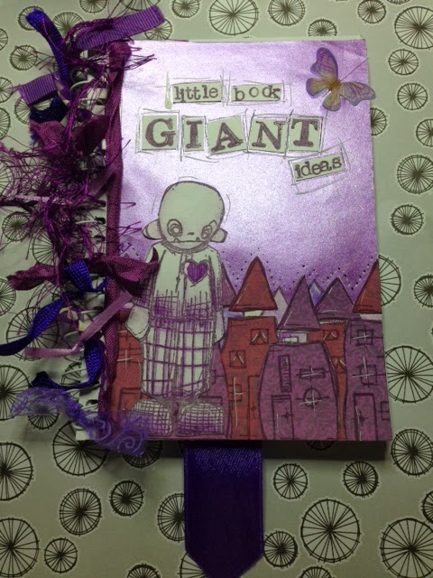
This version has a different colour way, and a sponged ink background. Oh, and added bats..... This is the one I made into my DT card- as for the other Edward, well I have plans for him too, watch this space!
And finally, my poor little mask looks like this. Hmmmmm, quite interesting looking really, I may have to find a use for it......


Hope you found this interesting, and don't forget the Man Up! challenge, hop over to the challenge blog now for the details.